
Mentor Buddies is a mobile app where members can find a design expert to chat with for about 15 minutes, in exchange for a small donation to the charity of mentor’s choice.
My role: UX Designer
Timeline: December 2020
Context
Mentor Buddies was created by multimedia designer Grace Ling. It branched out from Grace’s popular Slack community Design Buddies, which had a dedicated channel for those seeking mentorship. This virtual community helped numerous designers to secure mentor support they needed. The success of this concept led Grace to create a dedicated app just for this purpose.

Problem
Users open the app but don’t sign up for a mentor session.
User Research
Stakeholder Interview
Key findings from an interview with Grace Ling, founder of Mentor Buddies:
Mentors and mentees report having a great time connecting with each other
The chat function works well, with little to no technical issues
Less than 2% of the users who downloaded the app end up booking their mentor session
Grace Ling, Founder of Mentor Buddies
App Analytics
Less than 2% of the users who download the app actually booked their first session with a mentor. The drop off rates for the first few onboarding screens range between 60-86%. Based on this metric, I’ve identified Welcome, Create Profile and Mentor Profile areas as key points of friction in the onboarding process.

User Interviews
I conducted several interviews with existing Mentor Buddies users. The findings have confirmed my hypothesis about Welcome and Create Profile Screens being points of friction.
Users felt the onboarding experience was not specific enough to provide a tailored match.
Users needed more justification for providing their data.
Users didn’t understand why they needed to create an account.


How might we design an onboarding experience that encourages users to book their first mentor session?
Ideation & Design
Welcome Screen
Guided by the research insights, we’ve decided to focus on the Welcome screen, as the first obvious point of friction. User feedback suggested that users didn’t trust the app to provide a good mentor match for them based on a single question. To address this issue, we decided to emphasize asking better questions and expanding copy to better explain the matching process.
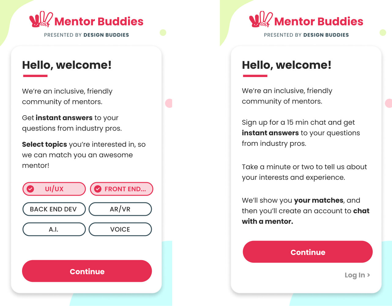
Welcome Screen - before and after
The original Welcome screen was expanded into a 3-screen flow. The new, more detailed questionnaire was designed to better assess the needs of first-time users and give them confidence in the quality of their matches.

New onboarding questionnaire
Create Account Screen
Next, we needed to address the high drop off rate from Create Account screen. For this, we used a two-pronged approach:
1) increasing user motivation by presenting high-quality mentor matches selected for them before asking them to sign up;
2) revising copy to emphasize security concerns when asking users to create an account and verify their phone number.
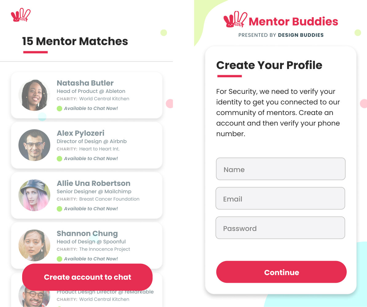
Revised account creation flow
Next Steps
To measure the success of our solution, we will conduct a new round of user interviews to see if the proposed onboarding flow improves user trust in mentor matches. Simultaneously, the new flow will be released to select random users and split tested to analyze the change in drop-off and conversion rates.