
Straight A: An App for Collaborative Studying
My Role: UI/UX Designer
Timeline: January - March 2020
Company: CareerFoundry
Straight A is a responsive web app designed to facilitate student collaboration, feedback exchange and socializing.
As a UI Designer, I was responsible for setting the visual design direction for the project and delivered mockups of varied fidelity along with a final prototype.

Context
With the rise of online learning, more students than ever find themselves affected by the nature of solitary studies. They often become discouraged and struggle as a result. Traditional brick-and-mortar universities have support systems in place for their students, ensuring peer support and knowledge exchange - something online learners often lack.
Problem
E-learners need a way to connect with other students to discuss topics, share insights, receive peer feedback on assignments, and find others willing to collaborate on projects.
Discovery
Following the research phase, I was supplied with a user persona: a 33-year old male (Alex), who works part-time and is enrolled in an online course. He is eager to gain marketable skills but finds it difficult to stay motivated while juggling work and studies.
Working with a persona helped me guide design decisions, set priorities and create empathy.

Design
I started by creating a series of sketches / low-fidelity wireframes in Balsamiq and Sketch to outline visual hierarchy and content.

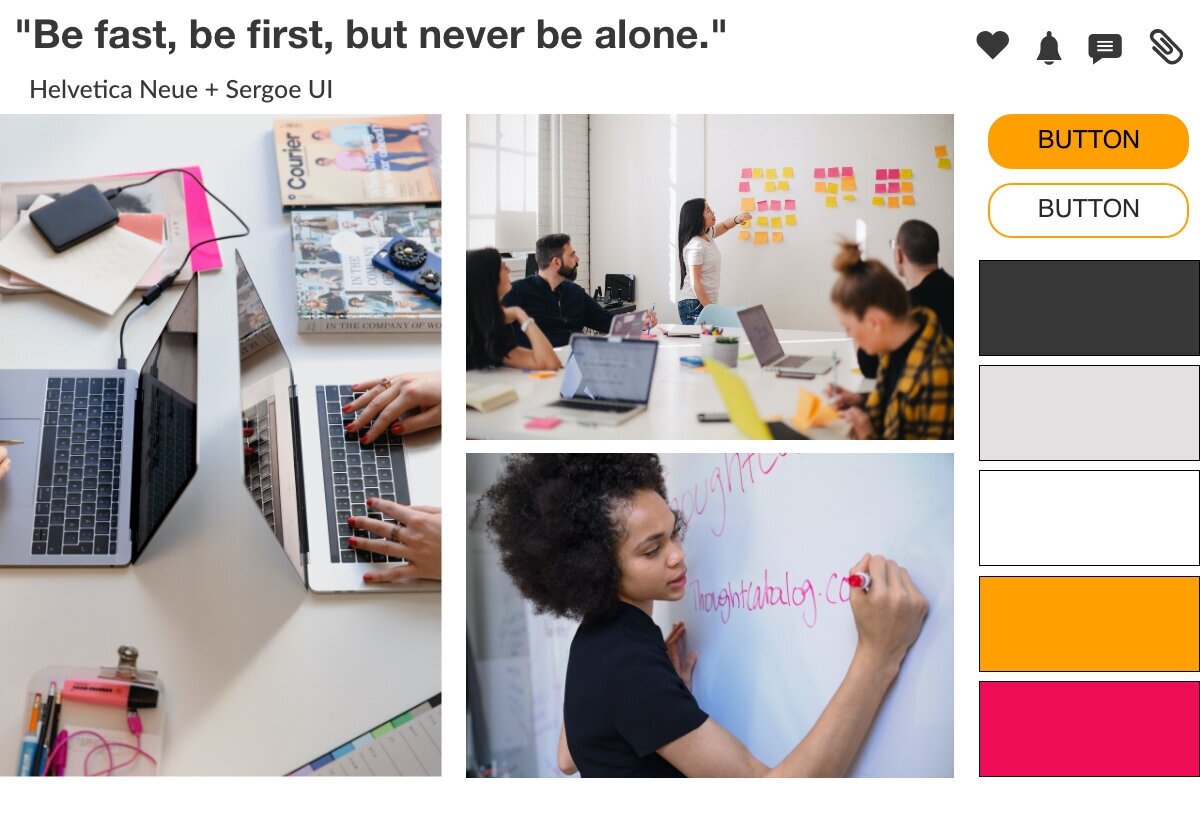
After the mid-fidelity wireframes were ready, it was time to decide on the visual direction of the project. In order to do that, I developed two distinctly different mood boards. In my opinion, the bold and bright mood board below better aligned with the character and needs of my user persona. A preference test has confirmed my assumption.
Final Mockups
By using a light background, I wanted to evoke the feel of a spacious, well-lit classroom and energize the users with high-contrast colors. Orange served as a second primary color to inspire enthusiasm and motivation. For accents, I used berry pink and complemented it with charcoal grey reminiscent of laptop screens and blackboards.

A mobile-first approach was essential for this project, but I also adapted the design for multiple breakpoints to allow users engage with the app both at home and on the go.

Style Guide
I created the style guide for Straight A using Frontify. This brand management platform allowed me to create a centralized database of key design elements and to easily implement any changes. You can access the style guide here: